Why the purple blue purple scheme works
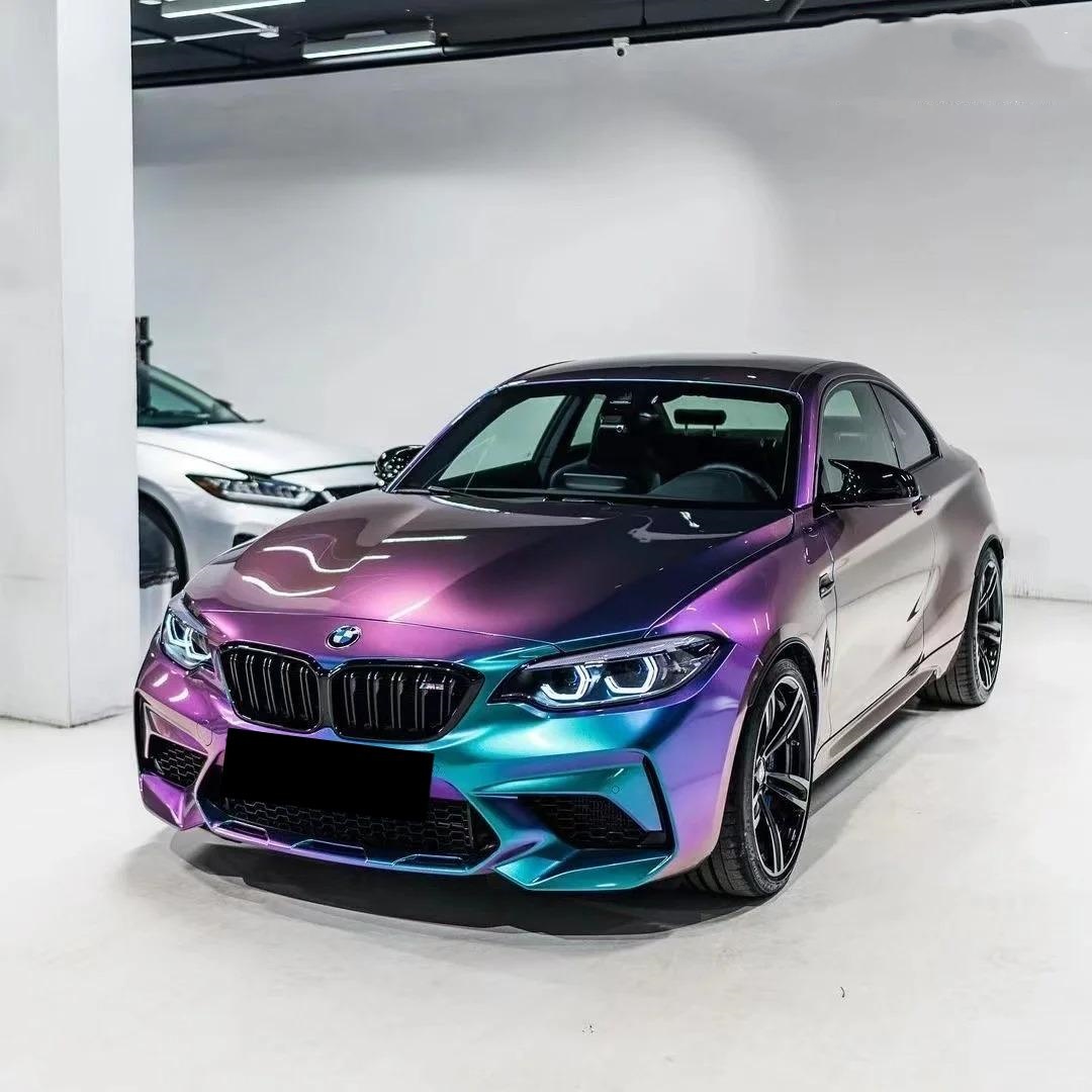
Purple (red-biased blue) and deep blue sit next to each other on the color wheel, so a tri-band gradient built as purple → blue → purple creates a continuous, rich hue cycle with natural symmetry. On vehicles, this reads as a sleek color flow from front to rear; in screen graphics, it adds depth without clashing complementary edges. When translated to a car wrap, the scheme can look like a factory finish at some angles and a show-car color shift at others—especially under directional lighting.
Where a tri-color gradient shines
- Automotive wraps. Use purple–blue–purple along the vehicle’s primary sightline (hood → roof → trunk) to emphasize motion. Concave panels (door scallops, bumper corners) intensify the mid-blue.
- Product photography & packaging. A centered blue “core” framed by purple edges highlights silhouettes without needing heavy shadows.
- Digital UI & brand assets. With careful contrast management, the palette works for buttons, hero banners, and charts while staying accessible.
Designing the gradient: stops, balance, and banding control
For a balanced look, place the first purple stop near 0–15%, the blue peak around 48–55%, and the return to purple by ~85–100%. This keeps the blue “core” centered while giving enough run-up for smooth interpolation on both sides. To avoid visible banding on 8-bit outputs, introduce a subtle lightness shift (1–2% L* per 5–8% of the gradient length) and add very light noise/dither in raster assets before export. If you’re printing or plotting cut layers for wraps, soft halftone patterns are unnecessary—the film itself provides the continuous tone.
Choosing materials for real vehicles
For complex curves and long-term durability, prioritize cast films (typically around ~2 mil) rather than calendared films (often ~2.5–4 mil). Cast films conform better to deep channels and tight radii and generally maintain appearance for longer outdoor lifecycles—ideal for tri-color effects across compound curves and panel gaps. If you want a ready-to-use, angle-shifting look, consider specialty films such as Aluko’s color-shift options; these deliver a baked-in multi-tone effect while preserving installability.
Explore category options for purple vinyl wrap and blue car wrap finishes. For a pre-tuned multi-tone look with strong flip, review our purple blue wrap (blue-purple chameleon) which delivers a controlled purple→blue→purple perception shift under natural and artificial light.
Lighting & viewing angle: make the gradient work for you
Directional lighting defines how the center blue reads relative to the purple edges. On wraps, plan your gradient flow so the “blue core” aligns with the body’s longitudinal highlight. Under sunrise/sunset (warm) light, purple channels feel richer; under cool LEDs or overcast daylight, the blue core stands out with crisper edges. If you shoot reveal videos, move your light along the car’s axis to emphasize the tri-band shift.
Legibility & accessibility on gradient backgrounds
If you’ll overlay typography (numbers, badges, sponsor marks) on the gradient, test contrast across the lightest and darkest portions. For UI or print text, aim for at least a 4.5:1 contrast ratio for normal text and 3:1 for large text. On darker purple edges, white often passes easily; on the mid-blue center, consider slightly darkening the background or adding a subtle shadow/glow behind text to meet contrast targets. This preserves aesthetic impact without sacrificing readability.
Color accuracy: keep the transition clean
In production, small color shifts can make a gradient appear “muddy” where purple returns from blue. On-screen assets: export in a wide-gamut profile only if your workflow supports it end-to-end; otherwise stick with sRGB and add a hint of dither to minimize banding. For printed or film outputs, target consistent color differences between adjacent patches; when measuring proofs, keep incremental differences small and uniform so the eye doesn’t catch sudden jumps in hue or lightness.
Application tips for wraps
- Panel planning. Map the gradient so seams occur where the hue is near-symmetric (left/right doors, quarter panels). This hides panel joins.
- Heat & stretch. Apply heat evenly and avoid overstretching at the mid-blue core; excessive stretch can lighten the tone and break symmetry.
- Edge finishing. Post-heat critical edges and recessed channels per film guidelines to lock the tri-band effect long-term.
- Top protection. If you add a transparent protection film over the wrap, choose one with high clarity and low orange-peel so the blue core remains crisp.
Quick recipe: a reliable purple–blue–purple build
Stops (HSL or OKLCH-like space):
- 0%: deep royal purple (rich saturation, slightly darker lightness)
- 50%: clean mid-blue (slightly higher lightness to keep the core vivid)
- 100%: return to deep royal purple (mirror the first stop’s values)
Export: sRGB PNG/JPG, add subtle dither to avoid banding on 8-bit displays. For print/wrap, request cast film with a purple↔blue color-shift or a tri-tone print validated on your target substrate.
Ready to turn the concept into a head-turning build? Browse Aluko’s base films, then speak with our team about panel mapping for your model and lighting goals. Start at our home page for the latest collections and installation resources on car wrap, or jump right into curated categories above.